Tonal Value Exercises
The importance of tonal value (how dark or light a subject is)
It is so much more important than colour. Try to learn about value, learn about complementary colours (opposites) and you will start to understand the different qualities of paint.
Moving from drawing to painting is hard enough without the distraction of trying to mix lots of colours.
If you force yourself to have less you will learn more.
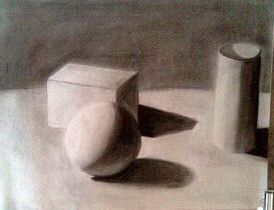
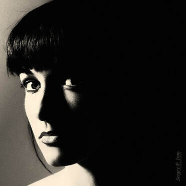
Creating 3-Dimensional objects on a 2-Dimensional surface.
Leonardo da Vinci developed the idea of chiaroscuro (meaning light to dark in italian) - the contrast between light and dark.
These shapes show a very simple yet implicit look at
the 5 basic tonal values that Leonardo developed.
Leonardo da Vinci developed the idea of chiaroscuro (meaning light to dark in italian) - the contrast between light and dark.
These shapes show a very simple yet implicit look at
the 5 basic tonal values that Leonardo developed.
- highlight - the area of most intense light on a form
- direct light - light coming from a source, shown on an object
- reflected light - light shown on a source that is not absorbed, but bounced off of the source
- shadow - the absence of light on an object
- cast shadow - the absence of light portrayed on an object, due to another object
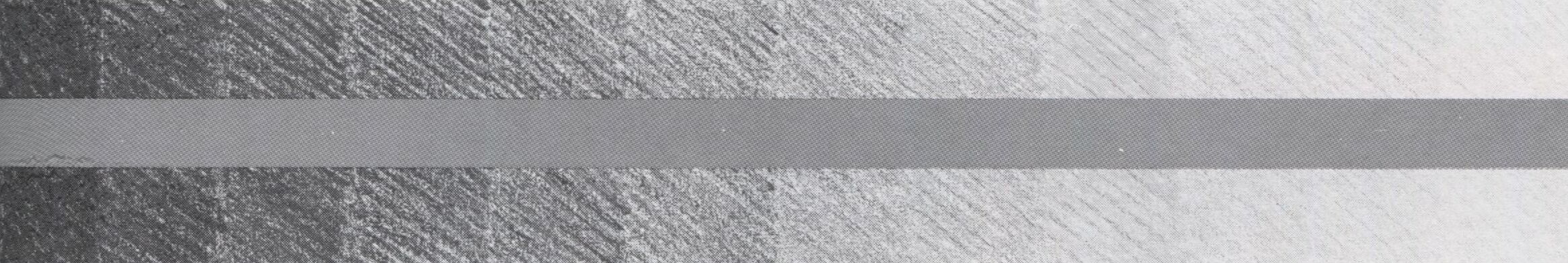
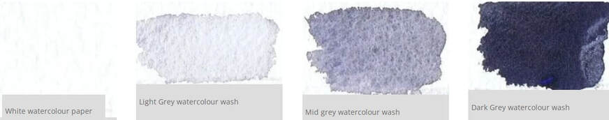
Above: This is a tonal chart (12 tones) - the central tone is of just one tone - one intensity.
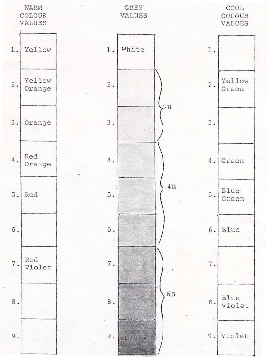
VALUES
When drawing with lead pencils one is turning colours into greys, these greys are called values. This can help you appreciate how each colour value becomes a different grey value.
Being aware of the various values when drawing or painting will help you create more interesting and realistic pictures.
Watercolour 4 Value Exercise
Lightly draw/sketch - then:
Lightly draw/sketch - then:
- The first consideration in watercolours is the whites – so leave highlight areas alone.
- Using a large brush lay a flat wash over all but the white areas.
- After above wash is dry – apply a second wash (60%)
- Finally a strong 90% wash for darkest areas.
Kessler's Barn Exercise
| colour_exercises__rankin_kesslers_barn.pdf |
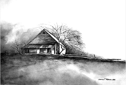
(image source unknown).
|
|
TONAL LAYERING
Make a tonal chart
Use the 4 different tones of Paynes Grey pictured in the table above.
For example is the white of the eye lighter than the reflected light in the pupil of the eye?
The answer is no. The white of the eye is actually quite dark and closer in tone to the mid grey.
Place a value scale on the top of the paper before painting. This gives something to compare every part of the photograph with
One can then ASK: “is this area closest to white, light grey, mid grey or dark?”
Make a tonal chart
Use the 4 different tones of Paynes Grey pictured in the table above.
- These tones used wet on wet or with soft and hard edges will create all the variations in value you will need.
- The technique is called tonal layering as each colour variation is layered on over the top of the dry wash underneath building up the saturation of colour as you go.
- The first light grey wash covers most of the paper leaving only the whitest areas.
- The second wash is applied over the dry first wash and leaves some of the light grey tones as well as the white.
- The final wash is applied over the previously dried washes and is used to add the finishing details, textures and colour variations.
- BUT – first start with a simple drawing!
- With the drawing do not draw elaborate detail – rather aim for correct positioning of features in relationship with each other (perspective).
- Identify your lightest and darkest tones first.
- In the picture below the lightest tone is the light on the right side of the face and nose and the reflection of the light in the pupil.
- The darkest tones are the pupil of the eye and the colour of the hijab.
For example is the white of the eye lighter than the reflected light in the pupil of the eye?
The answer is no. The white of the eye is actually quite dark and closer in tone to the mid grey.
Place a value scale on the top of the paper before painting. This gives something to compare every part of the photograph with
One can then ASK: “is this area closest to white, light grey, mid grey or dark?”
Sample Images for this exercise:
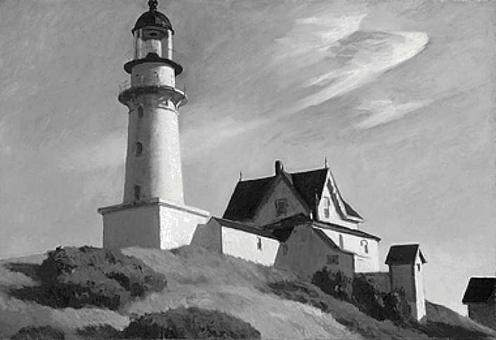
This watercolour painting has been scanned and converted to grey scale.
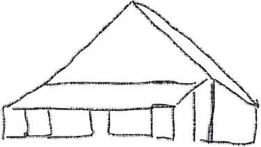
First:sketch the basic lines of the building. (image below)
First:sketch the basic lines of the building. (image below)
- Consider where to place the image:
- landscape or portrait orientation/high or low horizon?
- Leaving the whites alone - build up a tonal sketch in a neutral colour mix of your own choosing.
- Do the exercise again, but in colour.
