A BASIC COLOUR PALETTE
| basic_palette.pdf |
A great deal of things in nature are actually very muted, it is often the difference between light and dark and warm and cool colours, rather than the use of a bright colour.
A basic colour palette is somewhere in-between. It allows bright colour mixtures as well as subtle.
In his book “Blue and Yellow don’t make Green”, Michael Wilcox talks extensively about the colour bias of paint.
- If you want to paint subtle still life paintings, choose muted earth colours.
- If you want very bright, vivid abstracts, you might need some more man-made pigments that have a higher colour saturation.
A basic colour palette is somewhere in-between. It allows bright colour mixtures as well as subtle.
In his book “Blue and Yellow don’t make Green”, Michael Wilcox talks extensively about the colour bias of paint.
- Colour bias happens due to the trace colours found in paint pigments. They can cause trouble when trying to mix bright clean colours when you use the wrong paint pigments.
- One way to overcome this problem is to have a palette that consists of two of each of the primary colours, red, yellow and blue.
- He recommends a palette of 6 colours, two primaries each.
Colour samples below are from janebludellart website - excellent for comparing a wide range of colours.
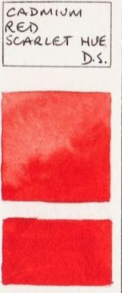
Cadmium Red
A red with an orange bias for mixing orange
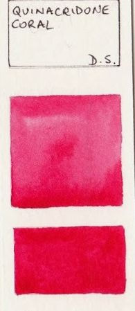
Quinacridone Red
A red with a violet bias for mixing violet
A red with an orange bias for mixing orange
Quinacridone Red
A red with a violet bias for mixing violet
|
|
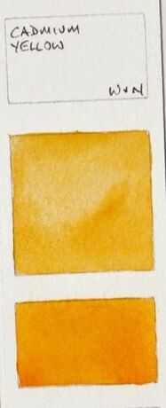
Cadmium Yellow
A yellow with orange bias
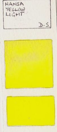
Hansa Yellow
A yellow with green bias
A yellow with orange bias
Hansa Yellow
A yellow with green bias
|
|
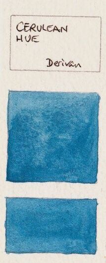
Cerulean Blue
A blue with green bias
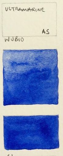
Ultramarine Blue
A blue with a purple bias
A blue with green bias
Ultramarine Blue
A blue with a purple bias
|
|
View Colour Wheel here
